濾鏡
filter: hue-rotate()
用於將色相旋轉濾鏡應用於元素的工具類。
| 類別 | 樣式 |
|---|---|
hue-rotate-<number> | filter: hue-rotate(<number>deg); |
-hue-rotate-<number> | filter: hue-rotate(calc(<number>deg * -1)); |
hue-rotate-(<custom-property>) | filter: hue-rotate(var(<custom-property>)); |
hue-rotate-[<value>] | filter: hue-rotate(<value>); |
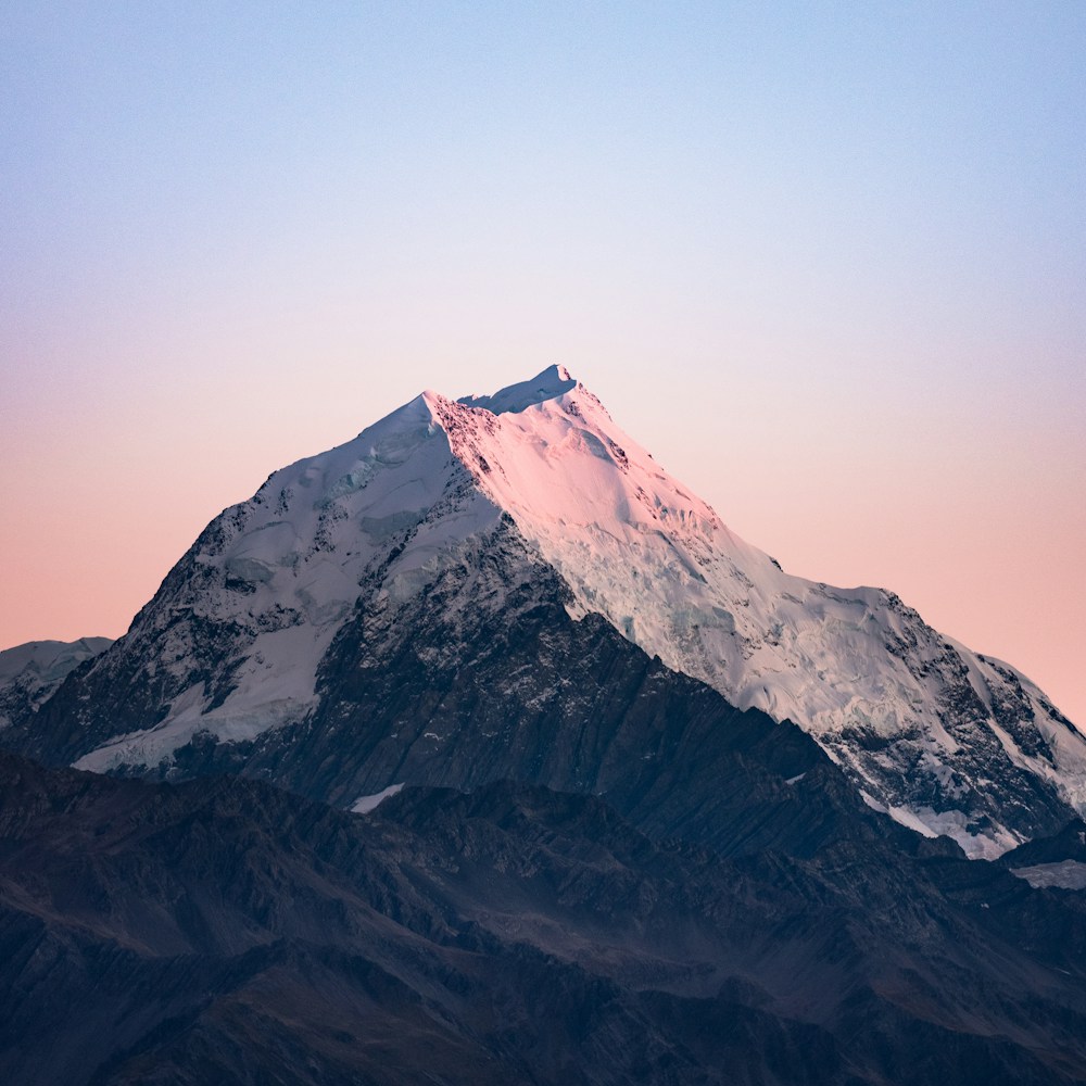
範例
基本範例
使用像是 hue-rotate-90 和 hue-rotate-180 這樣的工具類來以度數旋轉元素的色相
hue-rotate-15
hue-rotate-90
hue-rotate-180
hue-rotate-270
<img class="hue-rotate-15" src="/img/mountains.jpg" /><img class="hue-rotate-90" src="/img/mountains.jpg" /><img class="hue-rotate-180" src="/img/mountains.jpg" /><img class="hue-rotate-270" src="/img/mountains.jpg" />使用負值
使用像是 -hue-rotate-15 和 -hue-rotate-45 這樣的工具類來設定負的色相旋轉值
-hue-rotate-15
-hue-rotate-45
-hue-rotate-90
<img class="-hue-rotate-15" src="/img/mountains.jpg" /><img class="-hue-rotate-45" src="/img/mountains.jpg" /><img class="-hue-rotate-90" src="/img/mountains.jpg" />使用自定義值
使用 hue-rotate-[<value>] 語法 來設定色相旋轉基於完全自定義的值
<img class="hue-rotate-[3.142rad] ..." src="/img/mountains.jpg" />對於 CSS 變數,你也可以使用 hue-rotate-(<custom-property>) 語法
<img class="hue-rotate-(--my-hue-rotate) ..." src="/img/mountains.jpg" />這只是 hue-rotate-[var(<custom-property>)] 的簡寫,它會自動為你加上 var() 函數。
響應式設計
使用前綴一個 filter: hue-rotate() 工具類 加上像是 md: 這樣的中斷點變體,來僅在中 螢幕尺寸及以上應用該工具類
<img class="hue-rotate-60 md:hue-rotate-0 ..." src="/img/mountains.jpg" />在變體文件中了解更多關於使用變體的資訊。
